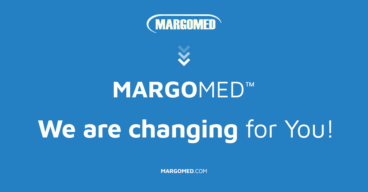
MARGOMED – we are changing for you!
- January 31, 2023

We are pleased to announce the rebranding of MARGOMED. Our new company logo combines modernity with timeless classics. We remain in the shades of blue that accompanied MARGOMED from the very beginning. Blue is the symbol of security, trust and stability. It is also commonly associated with the medical industry. There is a reason why we selected this colour. MARGOMED means 30 years of experience, the highest manufacturing standards and innovation.
The typeface has changed. The logo has become more legible, and the Maven Pro font we used is great for both the Internet and printed materials.
We also made sure it remains readable by changing the font width. The versions we used here are bold and regular. We also added a claim, in which we distinguished the word “quality”. High quality is something that definitely distinguishes MARGOMED from our competition. This value has been our guiding principle for years.

